When Richard amassed a large collection of old wood from the barn and old tenant's house to build the farmhouse table, we talked about options for using the rest of the wood. I always loved the idea of a having a wood-planked wall, so I showed him a few examples from Pinterest. Like this one or this one. We liked the rustic feel of those, and since the wood has so much character, we knew we didn't want to paint the planks.
We decided that the best place for a wall like this would be our downstairs half bathroom. We wanted it to be in a space that wouldn't feel overwhelming or darken up the room too much. And we also wanted a wall that wasn't huge. I liked the pictures that I'd seen of implementing the idea in a bathroom, but I also wanted to make sure that it was a bathroom without a lot of moisture -- so a bathroom with no showers. Which narrowed it down to the half bathroom downstairs.
Then we had to decide which wall we wanted to do. We nixed the back wall with the window on it because we thought it would darken the space too much and make the room feel tiny. We didn't really consider the two "side walls" very much, but pretty quickly landed on the wall with the vanity and mirror.
 |
| Our always-present helper -- she makes sure the paint smells the way it should. |
Then came paint choosing -- always a tricky venture for us. I originally thought a color like Palladian Blue would work well in there, but when we painted some sample spots, we didn't really love it. Richard thought a color with more green in it would be better, and I agreed.
He got three options, and we immediately ruled out two of them. I loved how the blues in Crocodile Dreams stood out compared to the other pale greens. It was a nice, light, almost-teal green. We both loved it. Until we painted three walls. Turns out, if you don't have the other greens to compare it to, it doesn't look very blue. It looks very, very green, and very, very pale.
It looked like an Easter egg. Or Easter candy. Or a gender-neutral nursery. Or any number of pastel green options -- none of which we wanted. And I was certain that it wouldn't look good with the deep brown of the wood plank wall. I don't even have many pictures of it in this state, that's how immediate the decision to change it was.
Richard headed back out to Lowe's (or maybe it was Home Depot) and picked out a dusty green that would look less... like Mylanta. He picked up a nice, dark-sage color: Behr's Olivine. And it's perfect. Seriously, so much better.
 |
| This picture/angle gives the most accurate depiction of the final color -- Olivine. |
So, on with the two coats of Olivine, on with the trim paint and ceiling touch up. Then Richard measured and cut, measured and cut, and measured and cut. He put up the boards two or three at a time, then visually arranged how he wanted the next few pieces to line up. He used a nail gun to secure them in place. We didn't want to glue the planks to the wall because we knew that if we ever want to take them down (or for selling the house) that removing glued-on boards would seriously damage the drywall. Plus, nail guns are fun!
He even let me nail the last board in place. He's a peach.
 |
| Putting the last board in place! |
 |
| Power tools, what! |
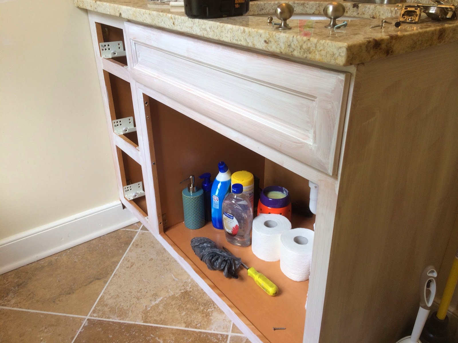
So, when we decided to paint the walls (twice) and taking into account the wood tones that we would bring in with the plank wall, we knew that the original state of the wooden vanity wouldn't match. I thought about painting it white but thought it would look to stark in dark-hued room. It seemed like gray was the best answer.
We compared about six paint swatches to find the correct gray -- one that would match the walls (painted and planked) and the counter top and tile. We picked one that looked perfect. It was a little more on the beige end which went well with the granite.
Then, at Lowe's (or maybe it was Home Depot), we realized we didn't have the chosen swatch with us. Or a picture of it. Or even the name of the Chosen Paint Color.
 |
| Primed and ready to be painted! Oh, and some bathroom detritus. |
So we guessed. Which is always a good idea. Well, anyone who's ever painted anything any shade of gray ever (there are more than fifty) will know that grays are tricky. Grays are not to be "guessed." It wasn't tremendously wrong, but it was wrong enough. It was a little too blue for the green walls and the beige-y countertop.
Since all else failed, we read the directions. Or something. We found our Chosen Paint Color (Glidden Pewter Grey) swatch and got the paint that we originally decided looked best in there. And so to go with the twice-painted walls, we have a twice-painted vanity.
 |
| Mid-second-coat. In the with the beigey gray, out with the bluey gray. |
 |
| The second vanity color went on after the plank walls went up, so that made cutting in a little more difficult. There were several of these very tight nooks. |
 |
| So I broke out the artist brushes to get into those little spots. It worked like a charm! |
Lastly (so far), comes the light fixture. Our original light fixture was this guy:
We knew we were going to change it out for something a little more fitting for the new feel (read: rustic), but we didn't have anything picked out. Not even an idea really. I looked up a few options and briefly considered doing two lanterns -- one on either side of the mirror. We ruled that out quickly and opted for something over the mirror like the original set up.
I thought about something with Mason jars, but that went the same direction as the lanterns -- a little too rustic. Richard set about getting the correct base for building a fixture himself, and he surprised me with the best light fixture ever! Seriously, it's better than anything I had in mind. And he built it himself! He's the best.
He used three of these bulbs and some electrical boxes. He just pieced it all together himself and added the necessary socket adapters since the original sockets didn't fit the fancy light bulbs.
We're in need of some more artwork, but I have a painting that Emmy painted a long time ago (one of my faves) leaned up against the wall for the time being. We also bought a new mirror from Homegoods -- one that fits the space and the feel of the room. And we got a nice, neutral rug that doesn't conflict with the other neutrals in the room or the textures already in place.
 |
| Emmy's painting -- loooove it! |
 |
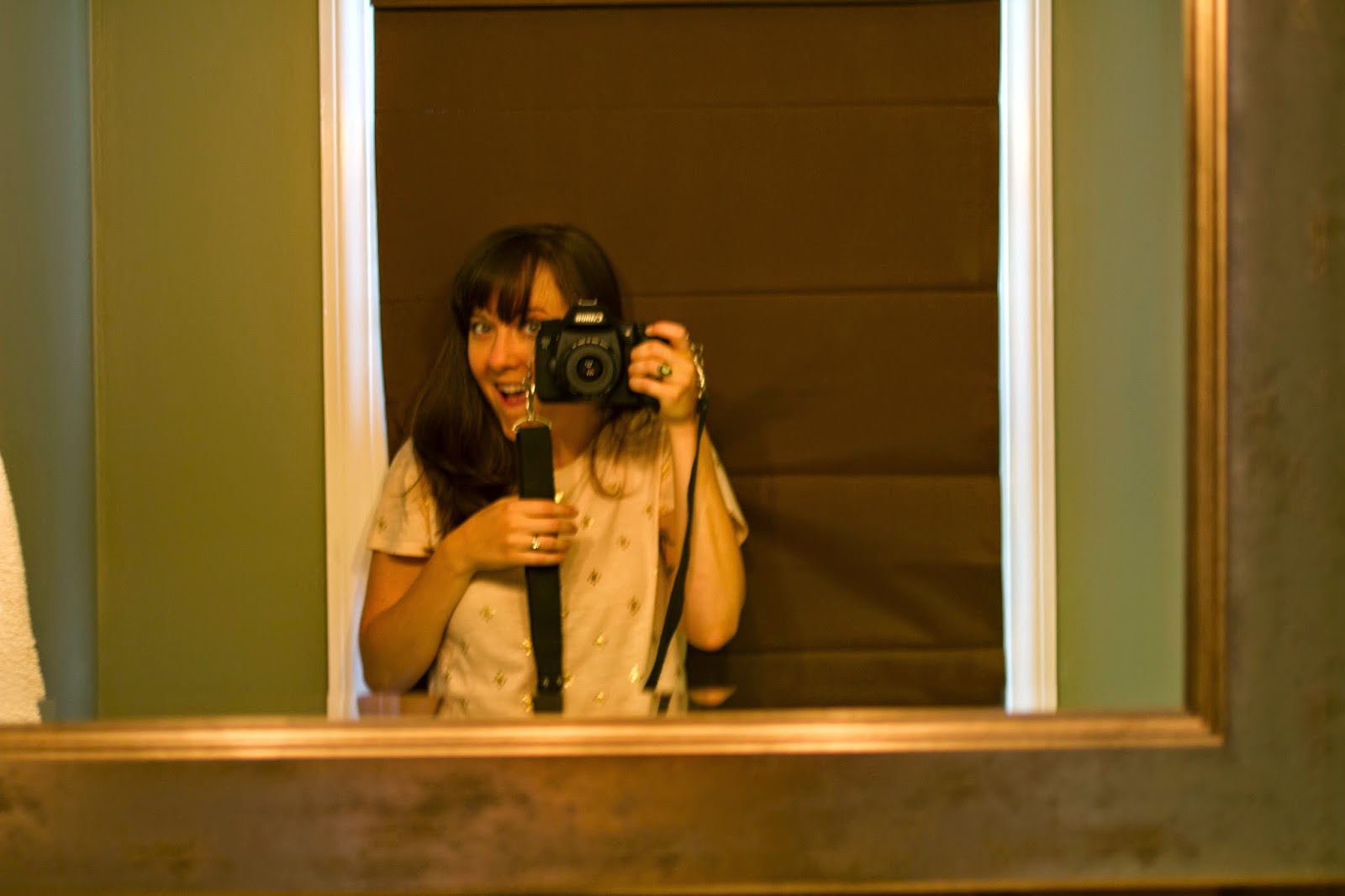
| My less-than-stellar attempt at capturing the new mirror -- it's too big/the bathroom's too small to photograph the entire thing! |
 |
| Cozy. |
 |
| Bonus! A new soap dispenser! |


No comments:
Post a Comment